Introduction
Let's begin by looking at the plot below -- what can we observe about it?
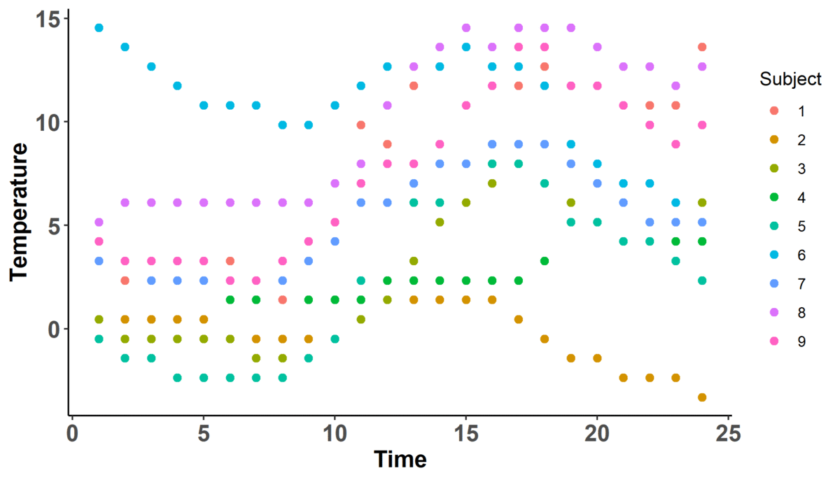
Immediately, we can observe that there are 9 'subjects' color coded according to the legend on the right hand side for which we measure temperature across time. We also can note that there are two dynamic components: the number of 'basis functions' (don't worry about what these are yet) and the shape of the actual curves; in fact, it looks like as the number of basis functions increases, so does the complexity of the curve (i.e. there are more wiggles).
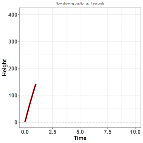
Pay close attention to when there is no indicator for basis functions on the $x$-axis -- when this is the case, there are only individual points on the plot. This is what we will refer to as the 'discrete' or 'raw' data. This is the data you would expect to see if you just recorded information. For example, imagine you threw a ball into the air and measured its position throughout its trajectory -- in other words, imagine at 1 second, you took a reading of how high it was. And then again, at 2 seconds. And so on. What you're doing is collecting data, discretely.
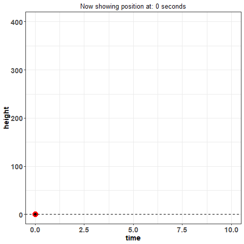
This way of looking at data is how we have traditionally viewed it -- it's standard. Now, think again of throwing the ball in the air and measuring its position: is that really the best way to measure the height of the ball across time? What if I asked you what the position of the ball was at 1.232847 seconds? You could probably make some kind of guess but you would certainly have trouble measuring what the true value is with that much precision. Moreover, measuring data in this way is subject to error. The way you measure might not be perfect: are you just eye-balling it? using some kind of device? And these problems aren't just unique to this example -- they are fundamentally a detriment to statistical analysis in general.
Luckily, this isn't the only lens from which we can view data. What if we knew where this data arose from? What if we could approximate some substitute for the true function from which this data came? In the example with the ball, we know the underlying physics equations that govern the movement of the ball.
Approximating these true equations is at the essence of functional data analysis (FDA). We first make an assumption that there exists some true underlying function from which the data arises -- in our example, this is the equation: $h(t) = 16t^{2} + vt + h_{i}$ where $h(t)$ is the height at time $t$, $v$ is the initial velocity (how hard you threw the ball), and $h_{i}$ is the initial height (e.g. were you standing on top of a building?). Here, we know this function, but often we don't -- it's why we use statistics. If we could explain behaviours using hard science, there would much less a need for us to collect and analyze data. Despite not knowing the true function, we still have the option to approximate the underlying function by some other approach.
So here's the bottomline: we want to work with the curves rather than the discrete points -- they provide us with much more information. For example, remember when I asked for the position at 1.232847 seconds? You couldn't answer that then, but you could now by using the equation given above. Working with curves will also give us access to derivatives -- this is how much the data is changing at any given point in time. Here, this refers to the velocity! Accessing additional information such as this becomes much easier when we use the paradigm of data as curves rather than discrete points. In this article, I will provide an intuitive understanding of how to make these curves from discrete data and an example of modelling using those curves.
Basis Functions
I mentioned basis functions earlier - what are they? Well, they're what we are going to use to build these curves. Basis functions are what are known as 'universal approximators' -- i.e. they can act as substitutes for the true function because they do a pretty good job of giving us the values that the true function would give. In the projectile example, if we had an initial height $h_{i}$ of 0, and initial velocity $v$ of 100, then at 1 second, the height of the object would be 160 feet. What we want is an approximation (approx$(t)$) that, when we plug in $t = 1$ into that approximation, gives us a value close or equal to 160! Again, the reason we want this approximation is because we usually don't know the true function (otherwise, we would just work with it instead).
Here's the definition of a 'basis expansion' $f(t)$ (a sum of $n$ basis functions):
$\begin{align*} f(t) &= \sum_{i = 1}^{n} c_{i}\phi_{i}(t)\\ &= c_{1}\phi_{1}(t) + c_{2}\phi_{2}(t) \hspace{0.2cm}+ \hspace{0.4cm}...\hspace{0.4cm} +\hspace{0.2cm} c_{n}\phi_{n}(t) \end{align*}$
Let's make sense of this. We have a sum and each term of that sum has two things: some value $c_{i}$, and some function $\phi_{i}(t)$. The latter are the 'basis functions' I have been referring to thus far and the former are known as the coefficents. The basis functions we decide ourselves and the choice depends on the context. Some popular basis include the fourier and polynomial basis functions. If we used a polynomial basis expansion, then the sum becomes:
$\begin{align*} f(t) &= \sum_{i = 1}^{n} c_{i}\phi_{i}(t)\\ &= c_{1}\phi_{1}(t) + c_{2}\phi_{2}(t) \hspace{0.2cm}+ \hspace{0.4cm}...\hspace{0.4cm} +\hspace{0.2cm} c_{n}\phi_{n}(t)\\ &= c_{1}\cdot 1 + c_{2}\cdot t \hspace{0.2cm}+ \hspace{0.4cm}...\hspace{0.4cm} +\hspace{0.2cm} c_{n}\cdot t^{n} \end{align*}$
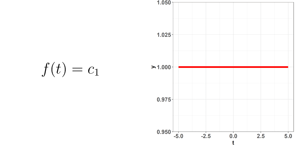
That is, the polynomial basis functions are: {$1$, $t$, $t^2$, ..., $t^{n}$} and they just replaced the placeholders we had: $\phi_{i}(t)$. If you hearken back to the first plot where one of the changing values was the number of basis functions, that is what is $n$ here. The larger the value of $n$, the more basis functions there are (as part of the basis expansion), and the more complex our curve gets. This should make sense intuitively! If we just had $n = 1$, then our basis expansion will just be one term: $c_{1}$ which is just a number; we would be saying that $f(t) = c_{1}$ i.e. no matter where we evaluate the function, the value will be the same. When we have $n = 2$, we get $f(t) = c_{1} + c_{2}\cdot t$ -- we have a slope and an intercept! We can continue adding terms to get more complex curves. The level of complexity we want will be based on the data we've collected and what we know of situation at hand. Going back to the projectile example, we know that the true equation is quadratic ($t^2$) so, when we attempt to figure out its approximation as a basis expansion, we will observe observe that a 3 term polynomial expansion suffices!
Okay, so we know how the basis expansion behaves when we add additional terms, but what about the values of $c$? These coefficients are what we are going to use to get very specific curves -- picking the correct combination of these is what is going to allow for those good approximations! This is where the raw data comes in -- using the information from that data, we can deduce what the values of $c$ should be. In this process, we want to make sure we don't overfit (remember, the data we collect is subject to random error); attempting to not overfit is not an exact science. I won't go into the weeds with this but just know that there are good ways to figure out the optimal values of $c$ based on the data you've collected.
Creating Functional Data
At this point, we already have all the tools we need to build functional data. We can just generalize a little bit to put everything together. Thus far, we have only considered the case when there was just one functional observation i.e. a ball is thrown in the air by just ONE person. What if 10 different people throw the ball? They all have varying levels of strength so the trajectory will be different. Furthermore, what if you gave people the option to throw it from different heights? Then in the equation earlier, we would find that $h_{i}$ and $v_{i}$ differs for each person. These are parameters that alter the trajectory!
Let's refer back to the first plot -- there, we had 9 subjects. You could think of these 9 subjects as 9 different people. We build a curve for each one of them (using basis expansions). As I alluded to earlier, the functions $\phi(t)$ within the basis expansions are set beforehand depending on the choice of basis (fourier, polynomial, etc.). These will remain constant across ALL your observations. What changes is the values of $c$ which depend on the raw data for a particular subject.
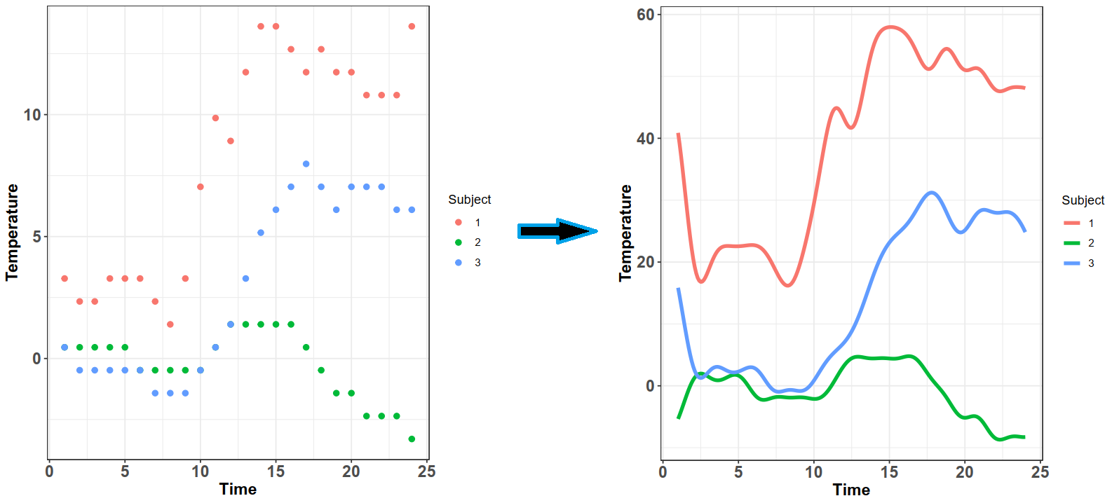
right is the corresponding functional observations formed using basis expansions.
In the image above, the color codes for the three subjects. We can see that the raw data differs significantly between the three and this is reflected in the functional observations on the right; all three of them have the same basis functions (in this case, a fourier basis), but have different coefficient values $c$ which alters the curves significantly. Also note that the curves are quite wiggly -- this is because I picked a fairly large $n$ for these curves; if I picked a fewer number of basis functions, the curves would be smoother.
And that's about it -- we now have functional observations. We can take derivatives of these observations easily by taking the derivatives of the basis functions $\phi(t)$. Note however, that this isn't the only way to get functional observations -- an alternative approach is to use functional principal components. I will omit the details because I plan on writing a detailed article on how those work, geometrically!
Modelling
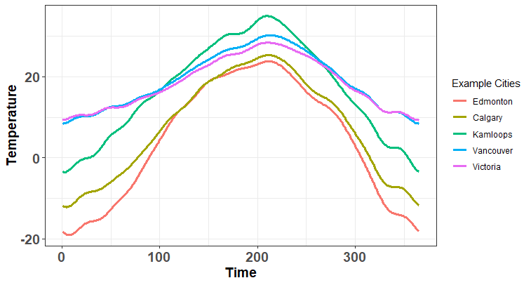
We have now gone through the effort of making these curves but what can we do with them? Let's first consider a classic problem (Ramsay & Silverman, 2006): imagine you are interested in how much precipitation you would expect in some city over a year e.g. what is the total amount of rain/snow in Vancouver in 2013? You suspect that there is some relationship between the temperature throughout the year and the total precipitation. The Canadian Weather data set contains information regarding both; there is the daily temperature readings for 35 Canadian cities along with the total precipitation that year.
Traditionally, we might look to fit this using a multivariate regression approach -- we would use the daily temperatures as predictors. Unfortunately, we run into an issue immediately: there are 365 predictors (one for each day of the year) but only 35 cities! If you don't know why this is an issue, just believe me when I say regressing on that many predictors for that few observations is a bad idea. Regardless, let's consider what this model looks like mathematically:
$\begin{align*} \text{prec}_{i} &= \alpha + \sum_{j = 1}^{365}\beta_{j}\text{temp}_{ij} + \epsilon_{i} \end{align*}$
This is a basic multivariate regression model where we are putting a weight $\beta_{j}$ on every day of the year. You can think of this as the effect on total precipitation. To clarify, the value of $\beta_{j}$ represents the average effect of temperature on total precipitation for some given day $j$ of the year. Heading into the summer, the values of $\beta$ would likely be lower because there is usually less rain/snow during that time of the year.
We are interested in figuring out how this works in the functional case i.e. what is the functional counterpart to the above model. In the case above, it's quite intuitive to think about 'weighting a day' because there is only two values involved -- the temperature of the day and the corresponding weights. In the functional case, we have curves meaning that each day has an infinite number of points - think about why this would be the case to really cement the central point of this article. The analagous model we build in FDA is known as a functional linear model:
$\begin{align*} \text{prec}_{i} &= \alpha + \int_{1}^{365}\beta(t) \text{temp}_{i}(t)dt + \epsilon_{i} \end{align*}$
It's actually not all that different from the original model other than we have infinite $\beta$ -- it's a function defined at every point, $t$. Remember back to when I discussed being able to figure out the height of the launched object at any time point? We can do that because we know the relationship. In the multivariate regression model, we only know the relationship ($\beta_{j}$) for the day but not at any high resolution: we can only know the effect on say June 12$^{th}$ overall but not the effect at 12:34 am on June 12$^{th}$! However, in the functional model above, we will know that effect because $\beta$ isn't just individual values now - it's a curve as well!
Instead of getting into the math of what is happening here, it might be easier to get an intuitive understanding through some visualization. Let's skip over how we find the optimal $\beta(t)$ but just know that there are some good ways of finding it - namely smoothing with some penalty (perhaps I will write an article on this too). An example of what $\beta(t)$ might look like is:
Take a look back at the functional regression equation - there are two things at play! There is the functional observation $x(t)$ and the functional coefficient $\beta(t)$. The observation $x(t)$ are those curves we been building thus far (e.g. the ones for the cities above) and $\beta(t)$ we find using some method - we are interested in the product of these two as that is giving us the the combined effect of the value of temperature for a given city $i$, and the corresponding time weight at those temperatures. Just like in the usual regression case, $\beta(t)$ is the same for all the subjects since it's the average effect (what changes is $x(t)$). We are going to be able to get predictions by using this estimated $\beta(t)$ multipled by some new functional observation, $x_{m}(t)$. In the following plot, we can observe these two curves (blue and black) along with the combined effect -- note that I have scaled the functional observation for better visualization.
So, to really hammer this home, let's look back at the functional regresion equation:
$\begin{align*} \text{E(prec}_{i}|x_{i}(s)) &= \hat{\alpha} + \int_{1}^{365}\underbrace{\underbrace{\hat{\beta(t)}}_{\text{Blue Curve}}\hspace{0.5em} \underbrace{\text{temp}_{i}(t)}_{\text{Black Curve}}}_{\text{Green Curve}}dt \end{align*} $
We can see on the plot the corresponding objects in the math! Finally, our prediction for precipitation will be the shaded green area -- that's just from the definition of an integral. Here's some examples of what those look like with different functional observations (i.e. different black curves i.e. different cities):
Those areas are:
$\begin{align*}
\text{E(prec}_{i}|x_{i}(s)) &= \hat{\alpha} + \underbrace{\int_{1}^{365}\hat{\beta(t)} \text{temp}_{i}(t)dt}_{\text{Sum of the green shaded area}}
\end{align*}$
So, there we go! We have gone from having raw data, to learning about basis expansions, building functional observations, and then making predictions using those observations.
Final Thoughts
While this will get you out the gates, FDA is a fairly vast field -- there are differential equation models, fPCA methods, curve prediction approaches, etc. What you have here is enough of an introduction to get a gist of what is possible using this approach. We get access to an arsenal of problem-solving tools that allows us to approach problems in a manner that wouldn't otherwise be possible! If you're interested in other problems that could be solved using these methods, check out my article on functional neural networks -- a generalization of neural network inputs through a marriage of deep learning and FDA.